
Hoping someone has an idea on this!
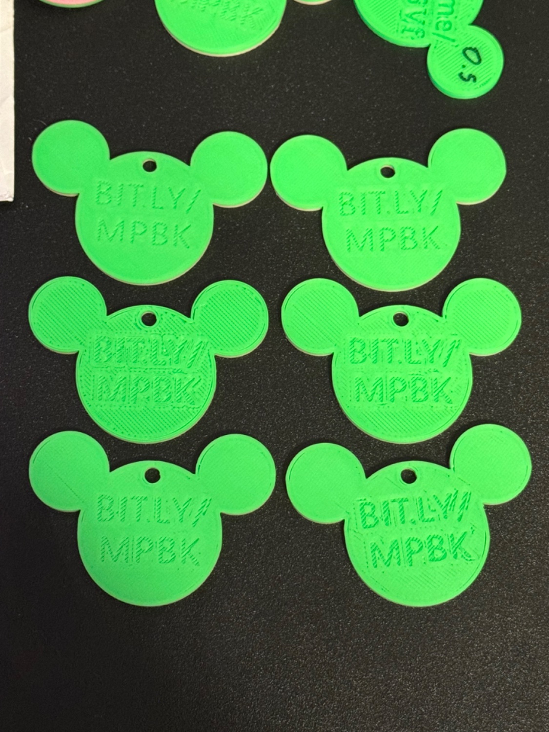
I’ve been making little Disney trinkets for my wife to hand out when we go to Disneyland, and feedback has been positive enough that I thought I’d try a little Etsy store to make some filament money.
Initially I added it into my base template in TinkerCAD but it kept coming out real bad, so I’ve been trying adding the text within Creality Print, and usually it looks pretty good but it can be wildly inconsistent.
The top two are from a batch of five where I set one up and then duplicated it. The middle two are from a batch of eleven, all duplicated from the first five that looked nice, and then the bottom two are that same batch of five that I tried printing a second time and it turned out way worse.
Any idea on why it varies so much and what I could do to resolve it?
There are multiple ways I have solved this. You can add a small chamfer into your design for every edge of the lettering, although this is a pain, or you can adjust the first layer expansion compensation.
Go with the empirical method and measure how far off the first layer is expanded compared to what the measurement should be. Then dial this average figure into your first later expansion compensation.
I know how this works with prusa slicer but I do not know how this terminology translates to Cura if you are using it or something else.
Interesting, I haven’t heard of using chamfers before, that’s a cool addition, I’ll look into that!