
3·
18 days agoGas for the motorcycle, and ride. Maybe $10 for gas and $5 for a coffee somewhere.
Gas for the motorcycle, and ride. Maybe $10 for gas and $5 for a coffee somewhere.
Nobody cares anymore.

As frustrating as this may be, it’s even more frustrating when I see exactly the same thing among PROFESSIONAL SOFTWARE DEVELOPERS!
directory structure and basic text editing are foreign concepts to them. If it’s not in their IDE, they really don’t understand it.
Also, 90% of them are hunt-and-peck two finger typists.
Really?
The PDF contains the information. The screenshot contains a picture of the information.
It’s a tree vs. a picture of a tree. A recording vs. a live performance.
Bullshit.
This whole endeavour is looking like a careful plan to implement a smaller, slightly less horrible idea in Win11, and then creep forward from there.
Remember the model to move the goal line, folks:
Best of all, these large steps can be supplemented by nudging things forward with ‘adjusttments.’
I wish we could really press the main point here: Google is willfully foisting their LLM on the public, and presenting it as a useful tool. It is not, which makes them guilty of neglicence and fraud.
Pichai needs to end up in jail and Google broken up into at least ten companies.

Teams doesn’t work in the first place.
My sister noticed in 1995 that Americans almost universally reply to ‘thank you’ with ‘uh huh.’
I can’t not hear it when I visit now,
Apollo 13.
Mostly factual, great pacing, gripping story, excellent acting, and an honest feel-good ending,
In fact, that and The Incredibles are two movies that I could show to almost any crowd with confidence.

Step one: stop listening to anything from Ziff-Davis.

No idea what Woot is, other than an exclamation on MMOs.
But PCMag has been around a long time. Since before they included AOL floppy disks with an issue.
Maple doughnuts with bacon bits are FANTASTIC! I was leery at first, but they truly rock.
Same here. The M720 is the best general purpose they’ve come up with. Now they need to improve it.
I got all inspired by this post, and took a shot of some of the Logitech mice I have around here.
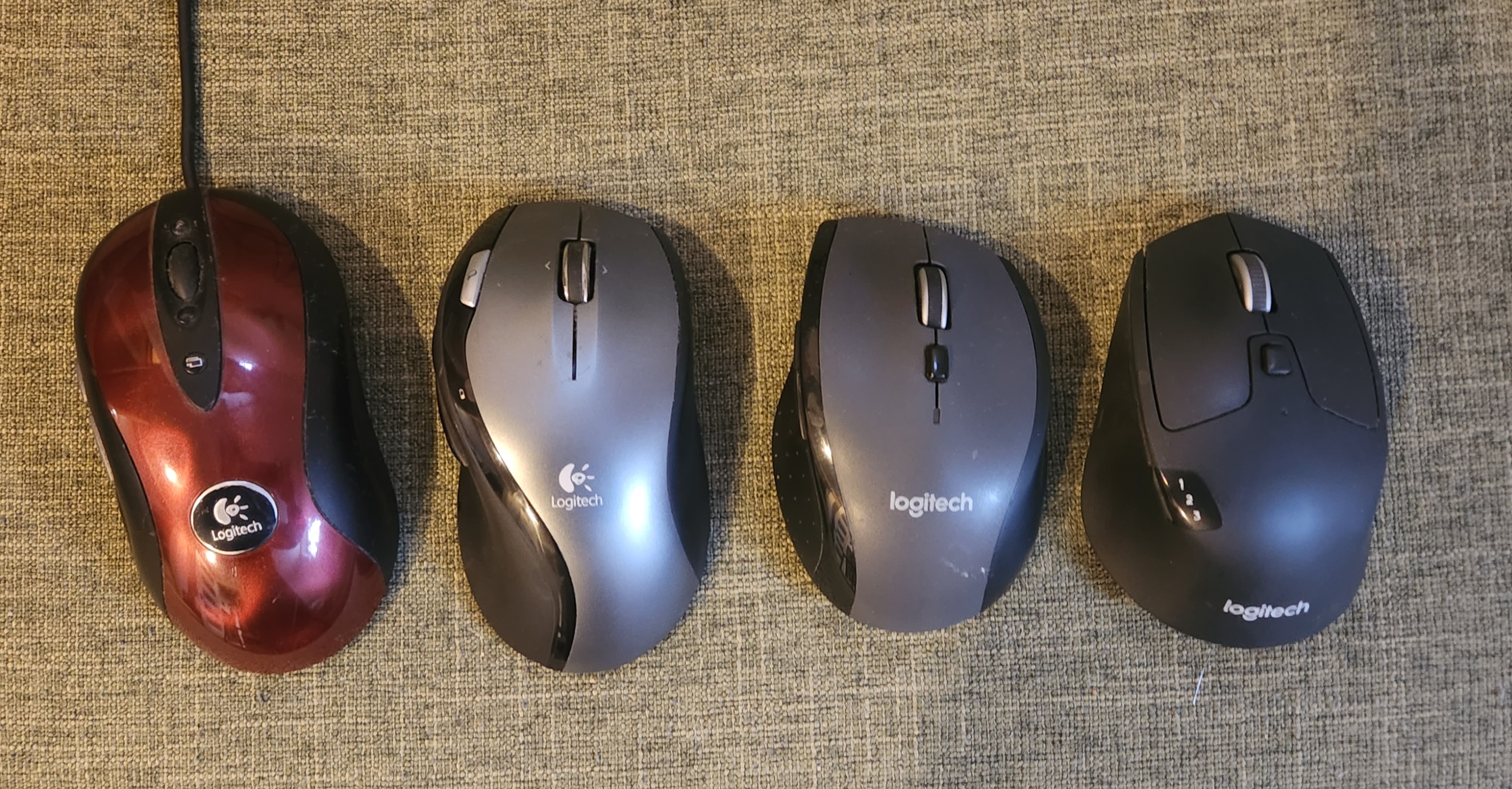
The red one (MX510) seemed so sleek and advanced in its day, and now is…large. And lumpy. And the logo is actually attached.
The M720 is the best of them. I wish they’d update it.
This is what they had before, which I see as lighthearted and whimsical.
If your source of fun comes from font choice on your (badly) shortened name, then that’s…not a lot of fun in my mind.
Their support is now at “support.logi.com.” Looks like they may be hocking a logi in the near future.
As far as I’m concerned, printing your name in a weird font doesn’t even qualify as a logo.
The leftmost one is good - and the full-colour version of it was pretty cool, back in the day.
The middle one is bland, except for the “g” which is dumb.
The right one is stupid, and keeps the dumb g.
Garbage. The graphic designers need to give their heads a shake.
Awesome! Gotta share this with my wife, an absolute nut for The Prisoner.


PfFt. Amateur level stuff!
Try this on for size:
https://www.audioquest.com/products/dragon-48-hdmi-cable
And that’s not the limit, either.