

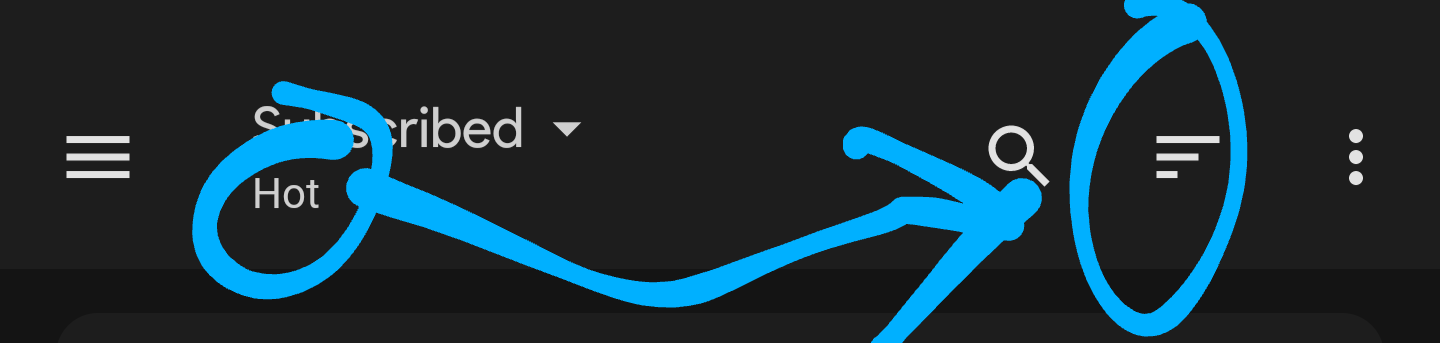
Others may disagree, but every time I find myself wanting to change the sort type, I tap the area circled on the left. But this opens the menu to switch between Subscribed/Local/All - instead I should be tapping the three lines on the right.
Would it maybe make sense to have “Hot”, “New”, etc appear with those lines instead?
No biggie, just an idea.
deleted by creator
Thanks, yeah, I do use it already when at the top of the page, but it minimises once I scroll down a bit. Appreciate the suggestion though :-)
Yes!! Please make this intuitive. It doesn’t make sense to display something on the left side but have to tap something on the right side to interact with it. Especially when coming from other apps that do this already.
Voyager app has the best implementation of showing the current sort type as an icon which acts as the button for changing the sort type as well.
But with Voyager I forget what all the symbols mean😅


