

In case you want to feel old, this change happened almost 10 years ago now fellow grandpas.
Bro what
Damn, my 30s flew by if 2020 was 10 years ago
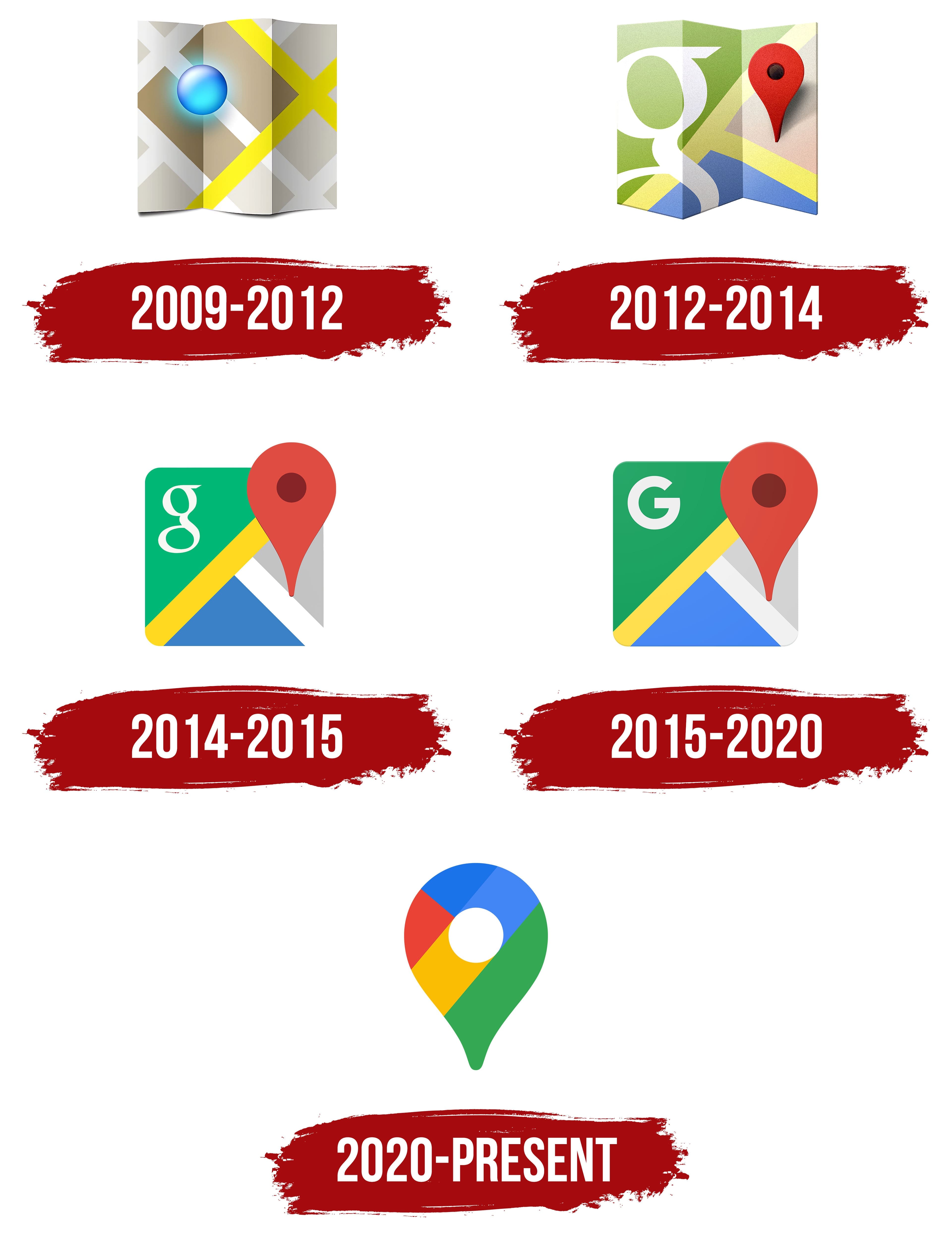
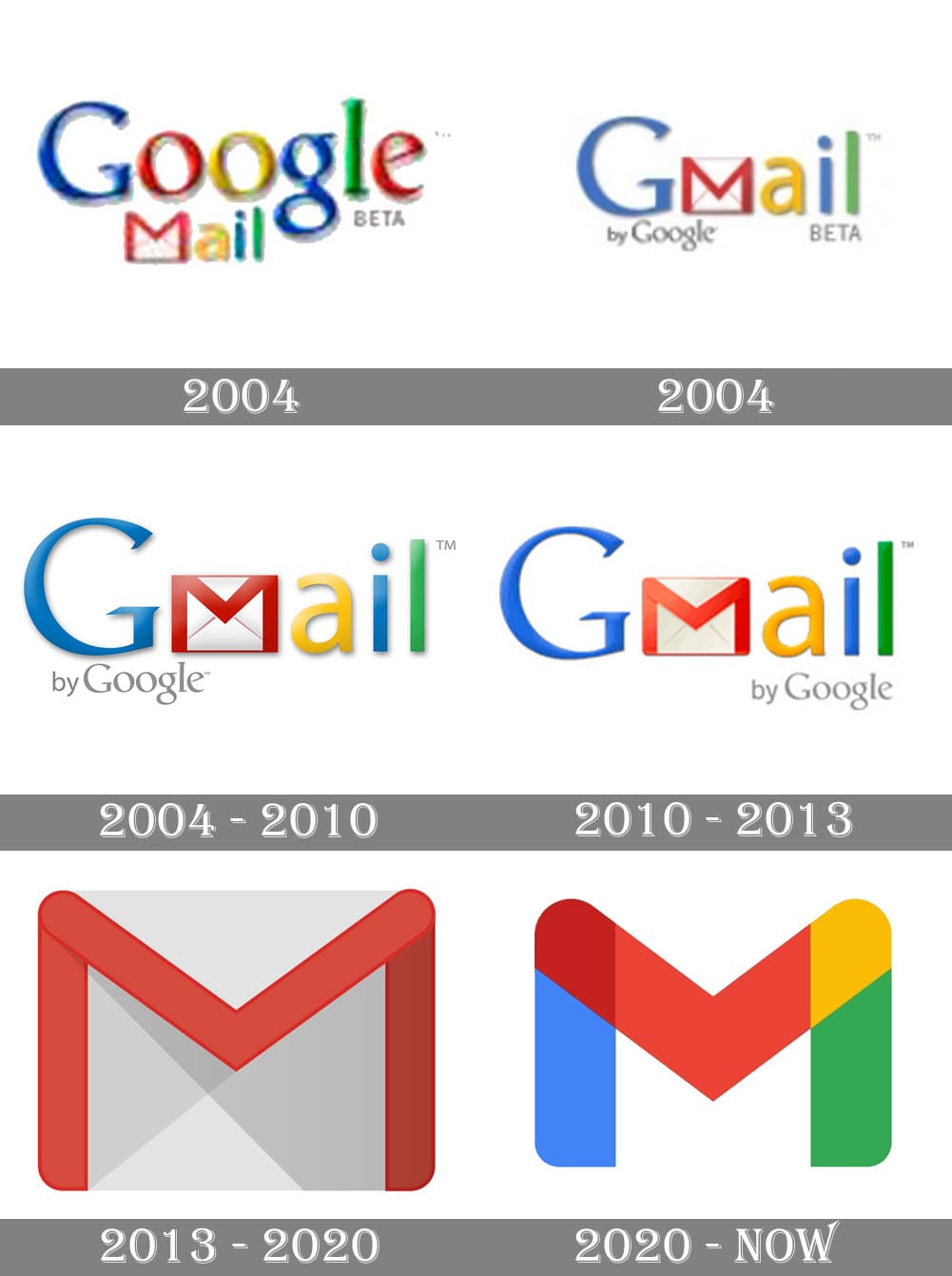
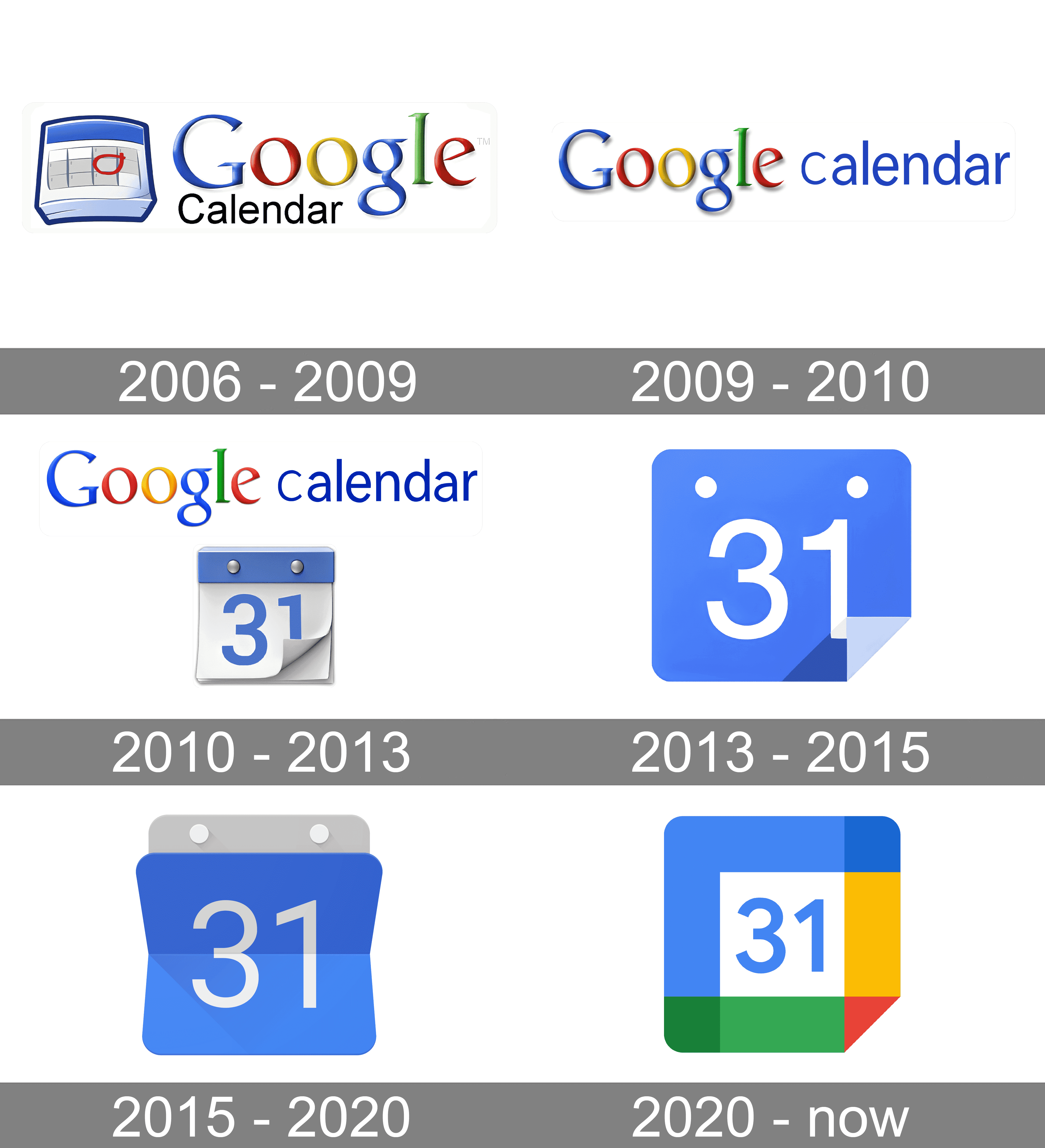
Ok so for me it’s the 2012 maps logo, the 2013 gmail and the 2015 calendar logo.
I confused it with their other branding changes from 2015, who cares I don’t use google anymore lol
[It could be sooo easy to solve, but noooo…

Without the distracting colors, now I can see this says MAPOD
I use an icon pack on Android to revert them to their previous icon, the new ones are indeed terrible…
I feel like it’s easier to use the monochrome mode of the phone than these icons
Not Google related, but whoever decide that the best color scheme for an Office suite should be light grey text on a white background deserves to be flogged.
Triumph of visual design over interactive design. These days, most “designers” only care about graphics visually. The much deeper science of how people use and understand things is beyond them. Worse, they think the problem is that everybody else does not “get” visual design.
Style over substance.
Worse, they think the problem is that everybody else does not “get” visual design.
This means they didn’t even make good design. Another example is KDE vs GNOME.
KDE: “We just did system we wanted.”
GNOME: “No, you don’t get it, this is design!”
Case in point: Every single thing Microsoft is doing in Windows these days.
oh noooo icons sharing a common design language and color scheme? the absolute horror.
if you can’t tell the difference between these icons i have a great educational resource for you
nah I still recognized all of them as google products bc they use the same 4 colors, but in different interesting ways. gmail was all red but a letter shape. Maps was a red pinhead. drive was a triangle but used all the colors but red. Calendar was a less noticeable shape but instantly recognizeable as a tabletop day calendar. now everything has to use all 4 colors and the shapes are so small that the colors can’t do enough on a phone screen to differentiate themselves.
They already had a common design language and color scheme. Now they have a samey-ness to them that takes away visual interest.
Try harder, you can do better than this.
i think they did need to unify the design and branding but i also agree they went too far with it. if they had only chosen 1-2 colors for each app icon that would have helped a lot.
gmail - red
drive - yellow
maps - green
meet - blue
calendar - lighter blue
problem solved
Problem solved! If we ignore the world’s ~300 million colorblind people.
i think they forgot to mention: they’re not all the same shape.
True. Colorblind people come in all shapes and sizes.
Ah, the old Lemmy shapearoo
Worked for a few jumps but then it sent me to kbin with a 50x error 🤷
Edited my comment with a different link, should be a bit longer now
Hold my shape, I’m going in!
oh no not again
Except that the original post was contesting that those shapes are indistinguishable from each other. My point, therefore, is that the solution offered in the post I replied to would still be indistinguishable to 300 million people.
the squares are there for comedic effect. the shapes are not actually indistinguishable. but at a glance, color is a much faster tool we use to identify these icons. so the problem here is that it takes longer for us to decipher a Google app icon, and the solution would be to differentiate the colors.
also this would help colorblind people as well, because removing unnecessarily complicated colors would make the shapes easier to identify as well.
Yes I understand the meme and I’m not trying to get into an argument. I’m just trying to educate as to why relying on color as the primary differentiator is not a solution to the problem as proposed.
at a glance, color is a much faster tool we use to identify these icons
Think about what you’re saying here, and consider how ridiculous it would sound if you said that to someone who was completely blind.
Sure, to a “color normal” person, something’s color is a great differentiator, but even when using a colorblind friendly pallette it’s just far easier for us to distinguish different shapes than colors. We’ve spent our whole lives adapting to a lack of color information so asking us to be able to work purely on color alone is like asking a blind person to see.
Again, and this part is really important and oft overlooked - this applies even when a designer has gone out of their way to choose a colorblind friendly pallette. It’s just not that easy for us. I honestly couldn’t even tell you what Google’s corporate pallette is without looking and I’m sure that information is second nature to normies.
this image has two groups:
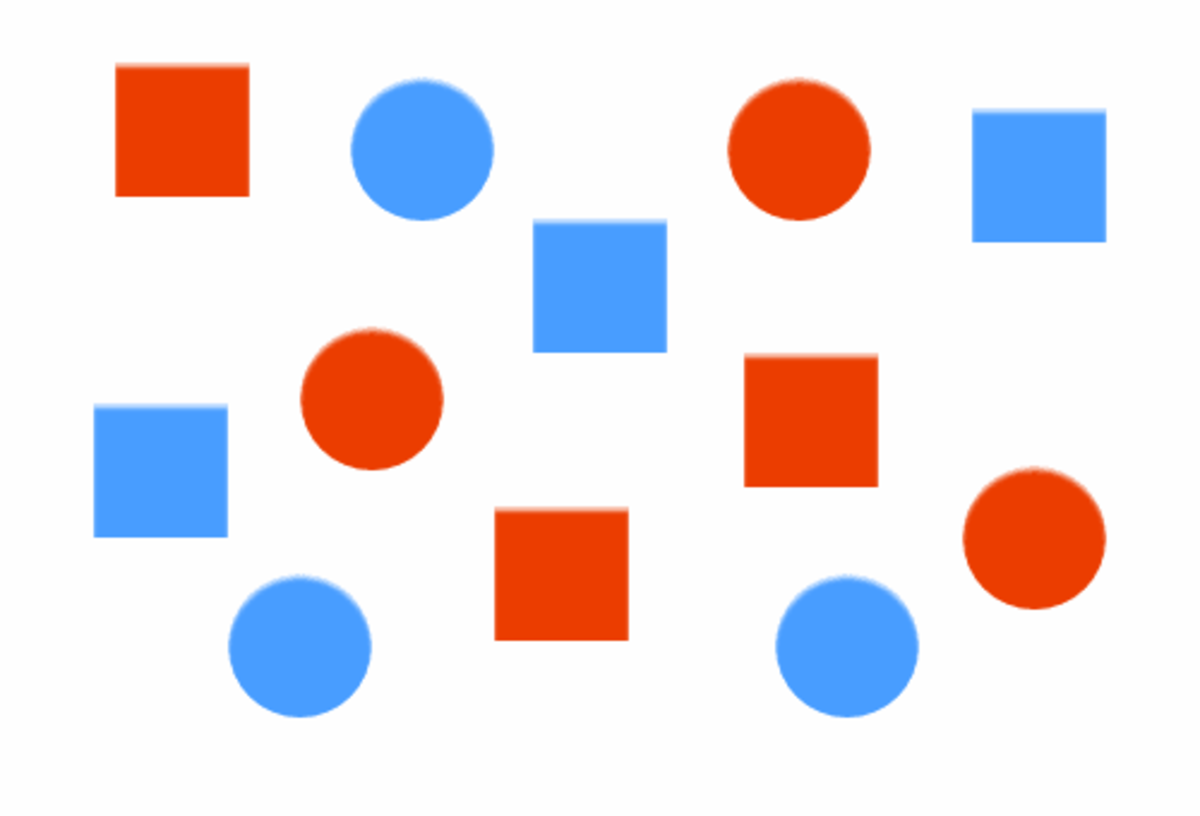
at first glance did you separate it into red v blue or circles vs squares?
you’re absolutely making things up. we’ve evolved to differentiate shades as well, which supercedes colors. even for colorblind people this kind of image should be differentiated by color or shade first.
not to mention not all people have perfect vision, in fact people with blurry vision probably outnumber colorblind people, and that would make the shapes not extremely reliable, especially when most icons would be more or less squares and circles with small details changed.
then what is your solution? do you expect them to redo their entire corporate branding palette?
Nope. The icons are honestly good enough as they are, but the original post was being disingenuous in suggesting they’re no more distinguishable than squares.
Running with that logic, having each square a different color does not solve the problem for those of us who can’t easily distinguish those colors.
The icoms would still have different shapes, right?
Yes, but the original post is suggesting that they’re ambiguous enough to all be squares. Running with that concept, making a bunch of squares different colors doesn’t fix the issue for those of us who can’t easily identify those colors.
No, it would just be the 🤣 emoji in different colors.
Most software pretty much doesn’t give a fuck about the visually impaired despite everyone talking big shit about accessibility. So I could certainly give a fuck what color someone’s logo is.
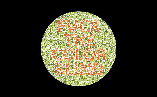
is that the one that says “fuck the color blind” because if so hey!! that’s not nice

Hey, color blind people deserve sex, too!
No way dude, it’s the other one that says, “we love the color blind.” Really.
Beat me to it.
I keep all my Google icons quarantined in one folder. Case in point:

Ugh… feels dirty to even have most of those apps installed.
Of those I have Gmail, Translate, and YouTube. I would get rid of those if got decent iOS alternatives.
Lol at the Photos icon. How does that in any way represent a photo or a camera? I guess it’s an iris shutter but that’s not something you notice too often on a real-life camera.
I think it was flower at some point.
I thought it was a shutter
Yea, it’s abstracted but based on aperture blades of the shutter.
I think it’s kinda morphed into a pinwheel, which still sorta makes sense as pinwheels have been a staple of photo and camera advertising for their bright colours and rapid movement.
Yea. I can’t actually recall the icons before the rebranding.
I can’t find photos on my phone without reading and I couldn’t find it in there either. I always click camera then go to photos from there.
I use nova launcher. It allows you to replace any app icon by any png file. So you can download the old icons from the internet and use them on your phone. It’s a lot of work and I agree Google shouldn’t have done this, but at least you can revert it if you want to put in the effort.
I also use Nova Launcher and had no idea you could do that! Thanks for letting me know.
The absolute worst is the idiotic “let’s make all app icons the same shape” thing.
For mostly all of my app-launching things I always prefer searching for text than searching for an icon. In pixel launcher, I always use the app drawer search, but an even better solution is in something like Niagara launcher.
To be honest the maps and the meets icons look better
It’s not even more aesthetic. Just more unified in branding.
I definitely find it more aesthetically pleasing. Just like the icon packs.
I think what really bothers me about the aesthetics is that the shapes are broken up by the coloration. For example, the pin icon for Google Maps looks almost like a hook, because the yellow has little contrast on this white background.
Whatever. It sucks ass is the point.
My point is that it’s also ugly.
And the interface of their apps are still incoherent af. I don’t know how, but they manage to make things worse every time
It’s ok, they’ll just retire the service eventually.
Yeah, the old logos were all over the place. At first glance it’s not obvious they’re all Google apps.
To me, that’s just the case for camera and calendar. Maps is IMHO perfect (except the unnecessary G) and the red-and-white envelope is quite well-known.
And? All of those being part of the same walled garden is a bug in the legal system not a feature.
Better be explicit about the walled garden rather than being diffuse about it
And that’s why I don’t really hate it. I hate Google, but I think it’s a neat design choice. I still hate Microsoft’s icon design a lot though, they can’t seem to stick with one thing.
I was yelling about how windows 11 swapped out text listingzs for copy, paste, etc from its contextual menus for stupid icons just the other day. Modern UIs are becoming so “streamlined” to the point of uselessness.
I’ll keep using my favorite icon pack instead, thank you very much
which do you use ? i am looking for a good one
Poppin, Olympia, Cyber, Minima and/or Outline, depending on the mood, season and launcher. There isn’t much left on factory spec with my phone.
I use Flat Circle. It’s not free, though.


