You must log in or # to comment.
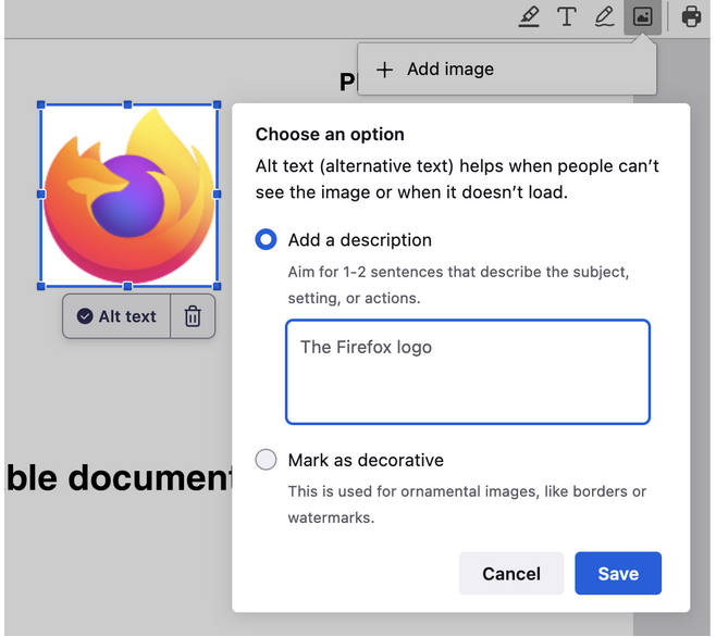
It’s a neat option but the example proof of concept alt text “The Firefox logo”, as I understand it, it isn’t ideal for describing the image.
Maybe something like this?
The Firefox logo which consists of a Fox wrapped around a sphere
That would depend on the context. How the logo looks like does not matter most of the time, only when the logo itself is the topic.
Makes sense. And if it’s not relative to the content you just put decorative only right?
So…
Welcome to Firefox ([Logo for Firefox] marked as decorative)
vs
Our sponsors are [Logo for Microsoft] [Logo for Firefox] [Logo for Google]


